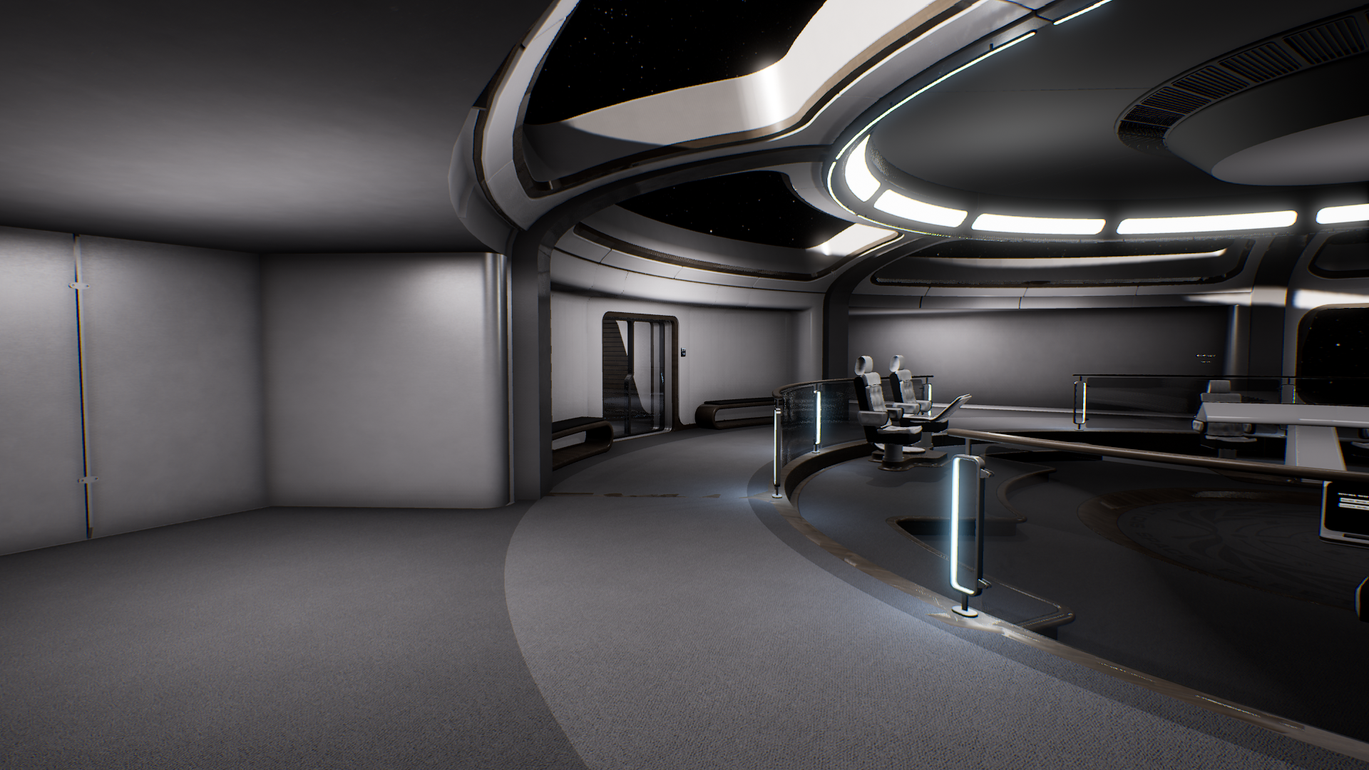
I’m not sure what happened to this week, it’s completely flown by and it feels like I’ve barely done anything. My screenshot folder would suggest otherwise, however, so let’s take a look at the new Bridge design
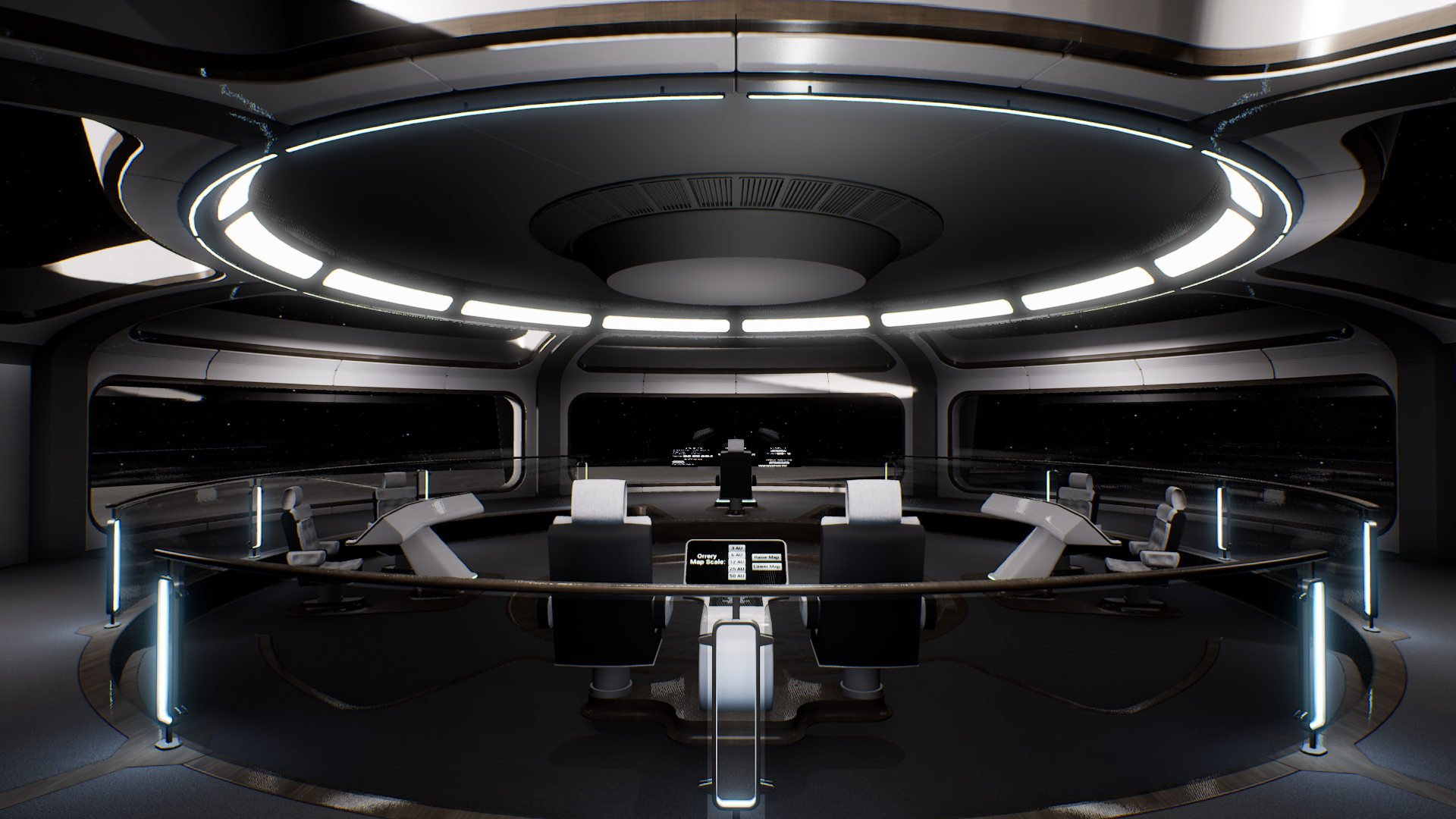
If you’ve been reading previous updates you’ll remember that I had to make the bridge windows vertical in order to incorporate UE4’s widgets for an information overlay on the glass. I was always planning to re-do the bridge properly at some point anyway, so really this was the perfect opportunity to fix all the things that were bothering me about the old design.
There’s still a lot to do, but hopefully, you’ll agree that it’s looking significantly better now:
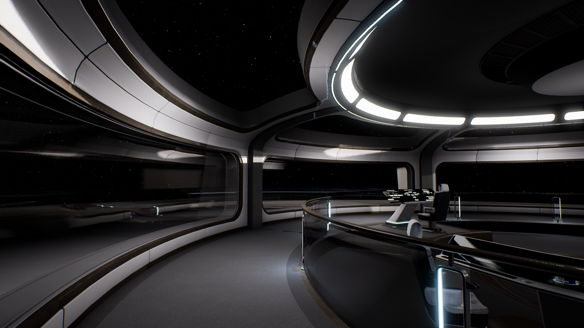
One of the biggest challenges was retaining that epic sense of scale that the previous panoramic windows provided, and after a good many failed experiments I finally settled on having a secondary set of ceiling windows going around the entire circumference of the bridge. It’s still not the entirely unbroken view from before, but it does retain that all-important vertical field of view for appreciating the scale of things.
The panels still need to be finished/aligned properly, but that should be a good indicator for the overall aesthetic.
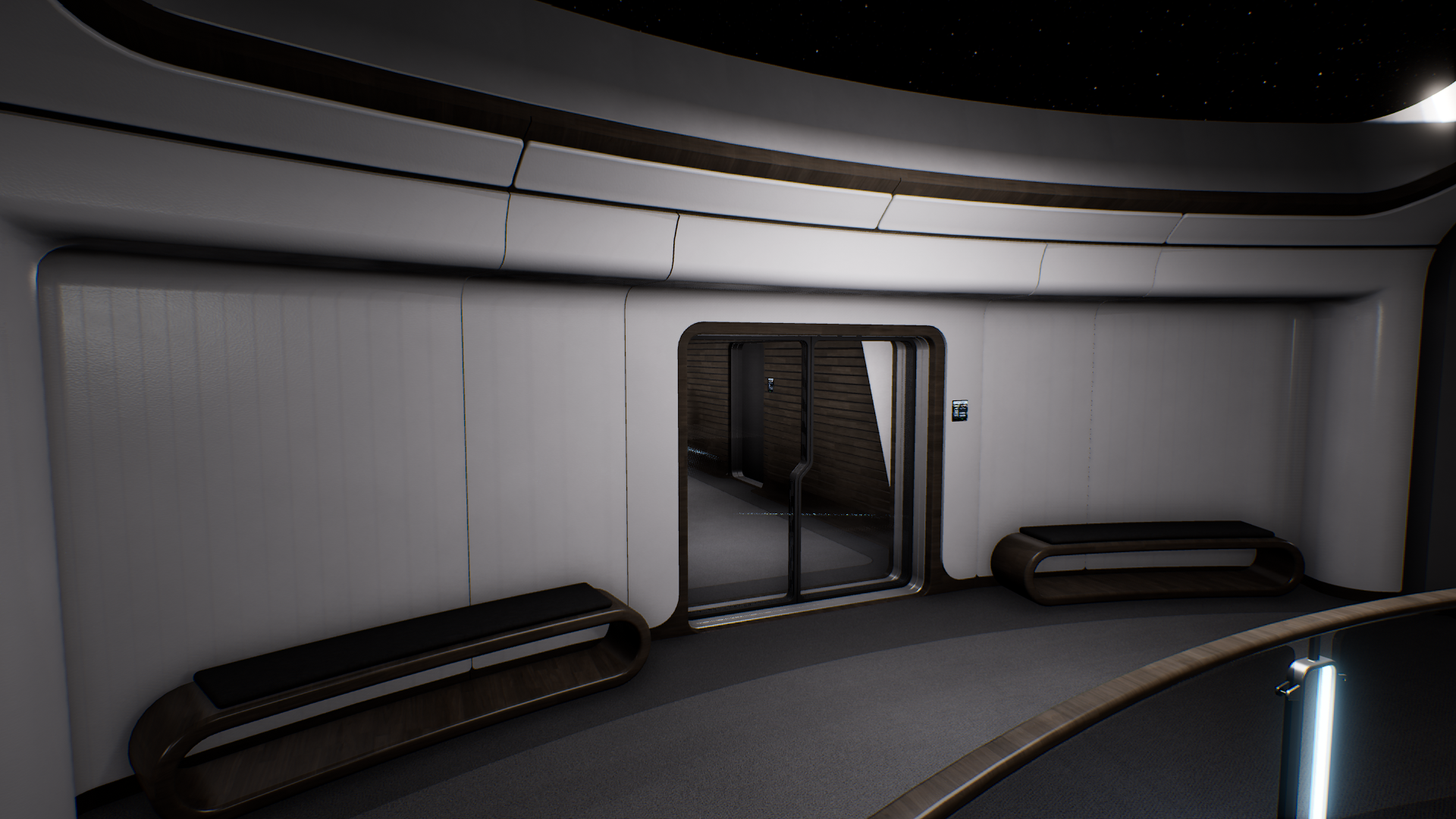
I’ve employed the same design language all over the bridge that you see on the rest of A Deck, as you can see here from the entrance alcove. I’m not sure about the benches… I think they’re good to have, but the design could use some more work;
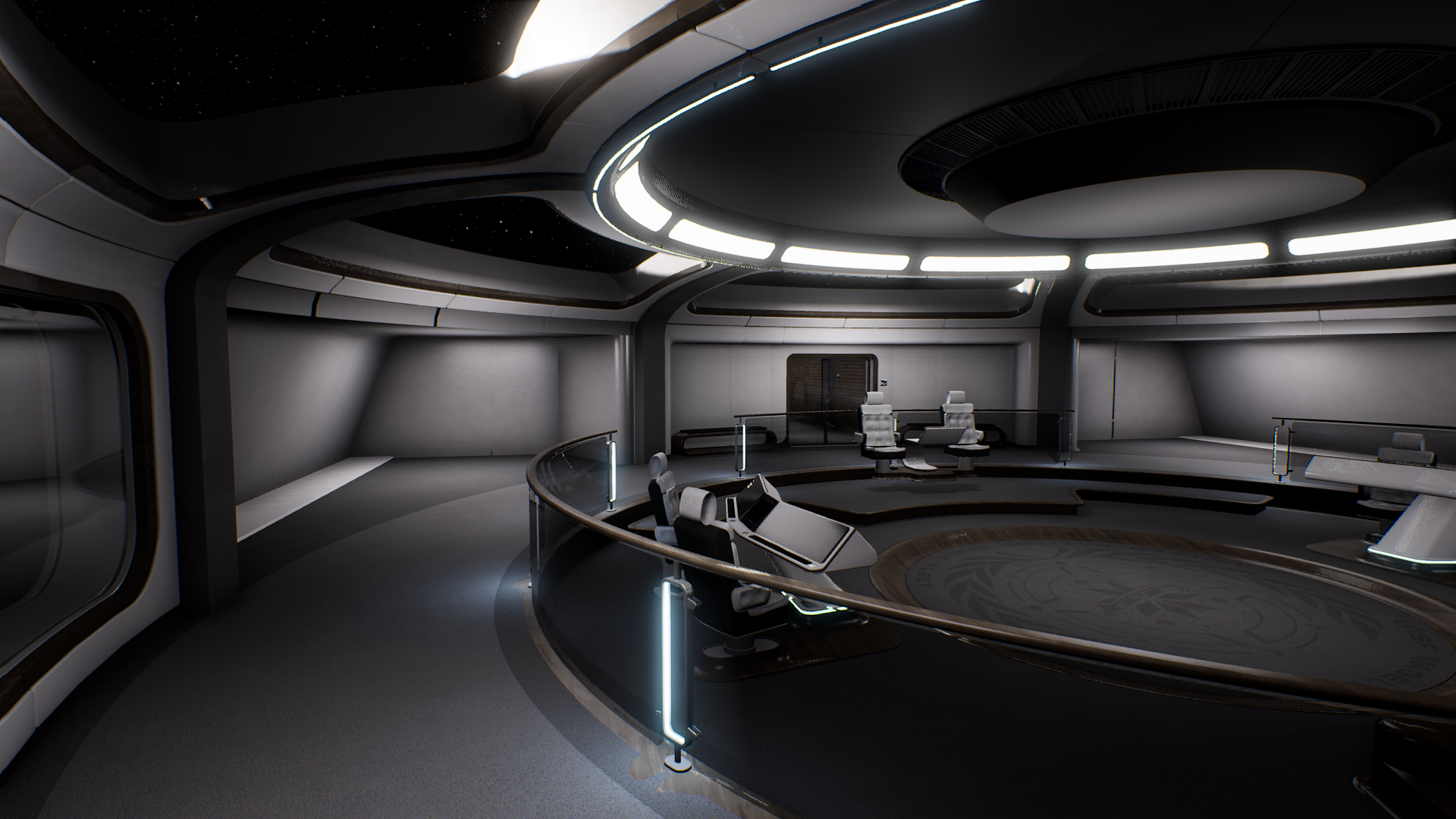
And finally we have the dreaded rear consoles that I was struggling to do justice to originally. I was going to have a curved alcove similar to the entrance, but that doesn’t really make the best use of the available space. I’m instead going with what are almost side-rooms, which offer a lot of wall space for screens and things. I can also use this area for the utility boxes for power/data etc;
I’m definitely feeling the design now, so it’s going to be interesting to see what this ends up looking like when it’s finished and polished ![]()

