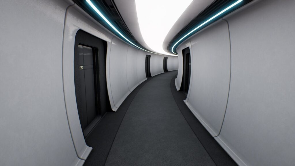
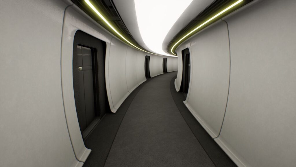
A few days ago I had a cunning plan to reduce the number of physical lights being rendered on the ship (they still represent the biggest GPU cost, so the more I can get rid of the better). I was thinking about how the alert lighting is handled, and it occurred to me that I’ve been wasting resources by having a separate physical light for both the alert strips and the main panels.
My solution was to add the Kelvin temperature of the main panel to the RGB value of the alert strips, and then have a single light casting the combined colour. It even takes the brightness of the alert strips into account, so the more you turn them up, the more of their light is added to the final colour value.
While I was at it I also did a quick overhaul of the faux GI (bounce) lighting so that it automatically casts approximately 30% of the main lighting back up towards the ceilings. This is also calculated dynamically now, so it will adjust itself to however bright the ship’s lighting is. This will really help with lighting accuracy when adjusting the ship’s lighting via the Environmental Control station on the Bridge.
Hopefully, it looks the same (if not better) than before with a third less GPU lighting overhead:
I also took a good long look at how the ship’s framework is affecting performance and decided to separate the basic walls from all the surface detail. By having only the low-poly smooth walls casting shadows from the sun and being used to calculate occlusion culling, there’s a lot less work for the CPU/GPU to perform. All the detail is then overlaid on top with shadow casting, occlusion and collisions disabled. The base walls do the hard work while the higher-poly detail mesh makes it look pretty for very little to no excess rendering cost.
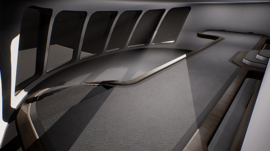
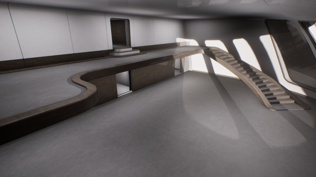
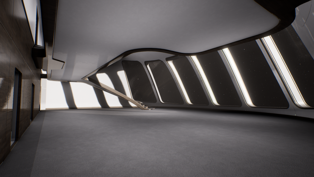
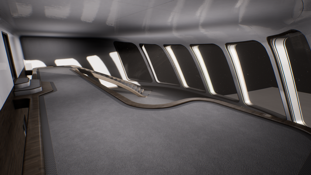
I then got back to working on the VIP Lounge, with a fair amount of progress made on the Balcony and Staircase:
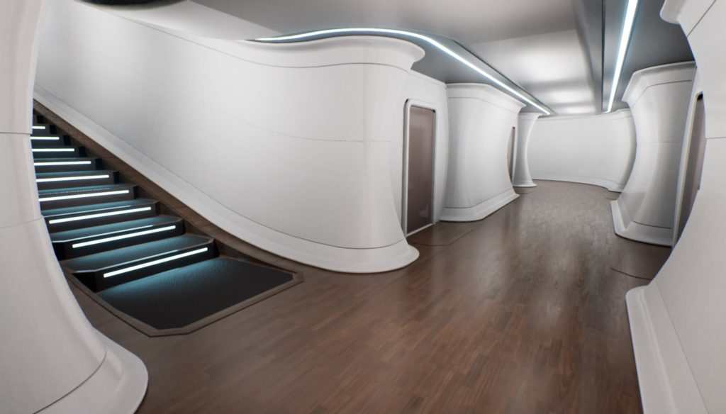
There’s still a lot of detail and polish to add, but I’m going with one of my very first concept designs for the staircase:
I’d forgotten how good the ship looks with a wooden floor actually. I look forward to adding that back via the customisation options
Replace the white walls with the new Bridge railing design and that should be roughly what it will look like ![]()

